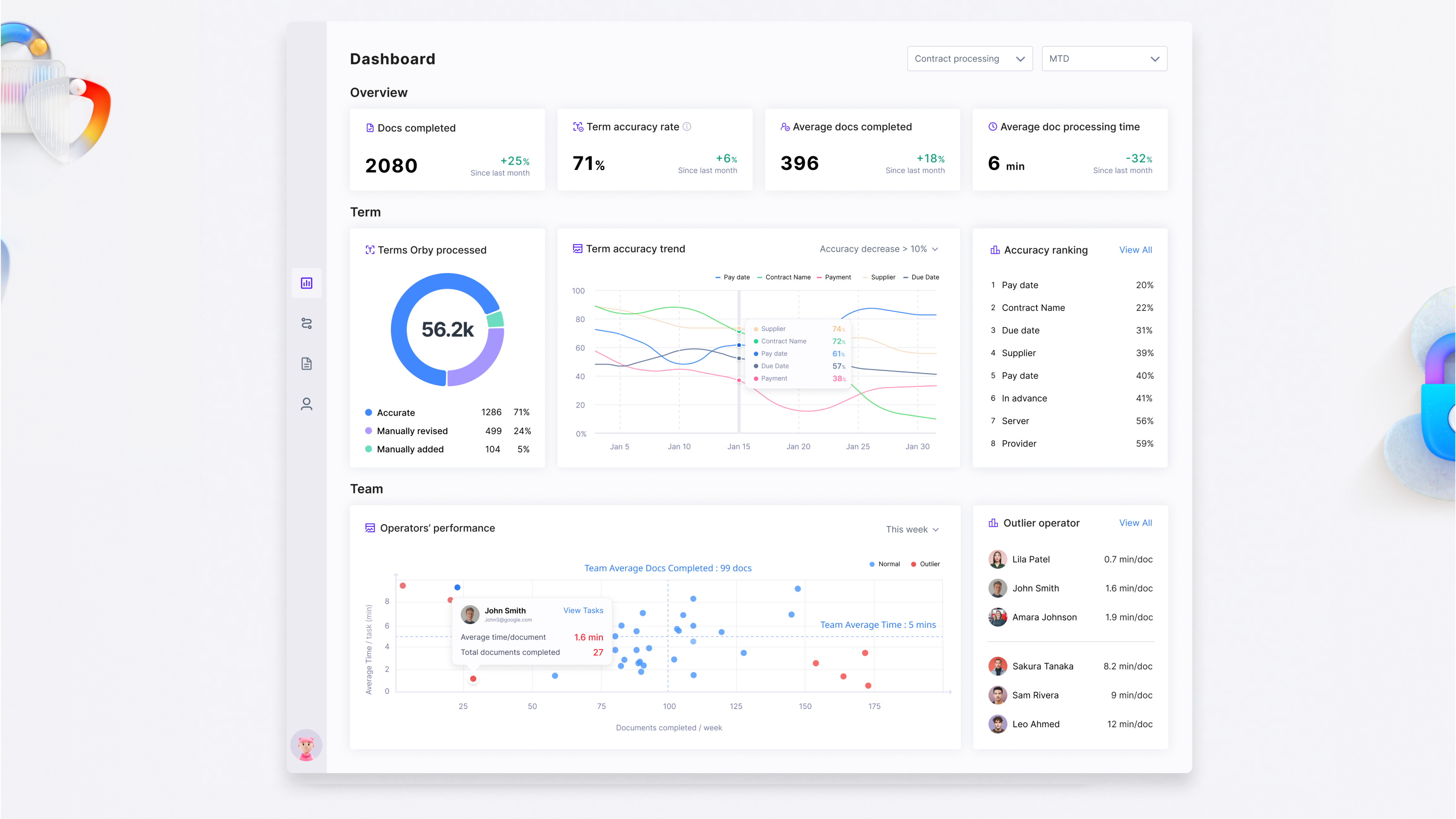
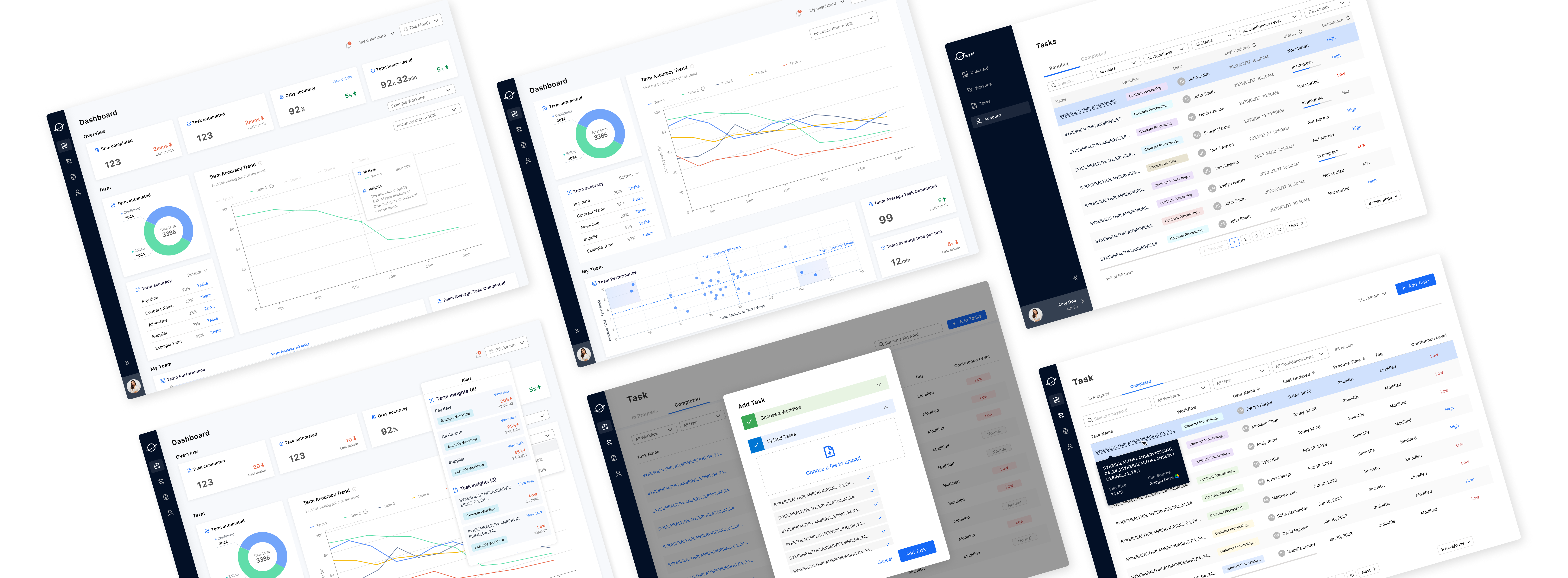
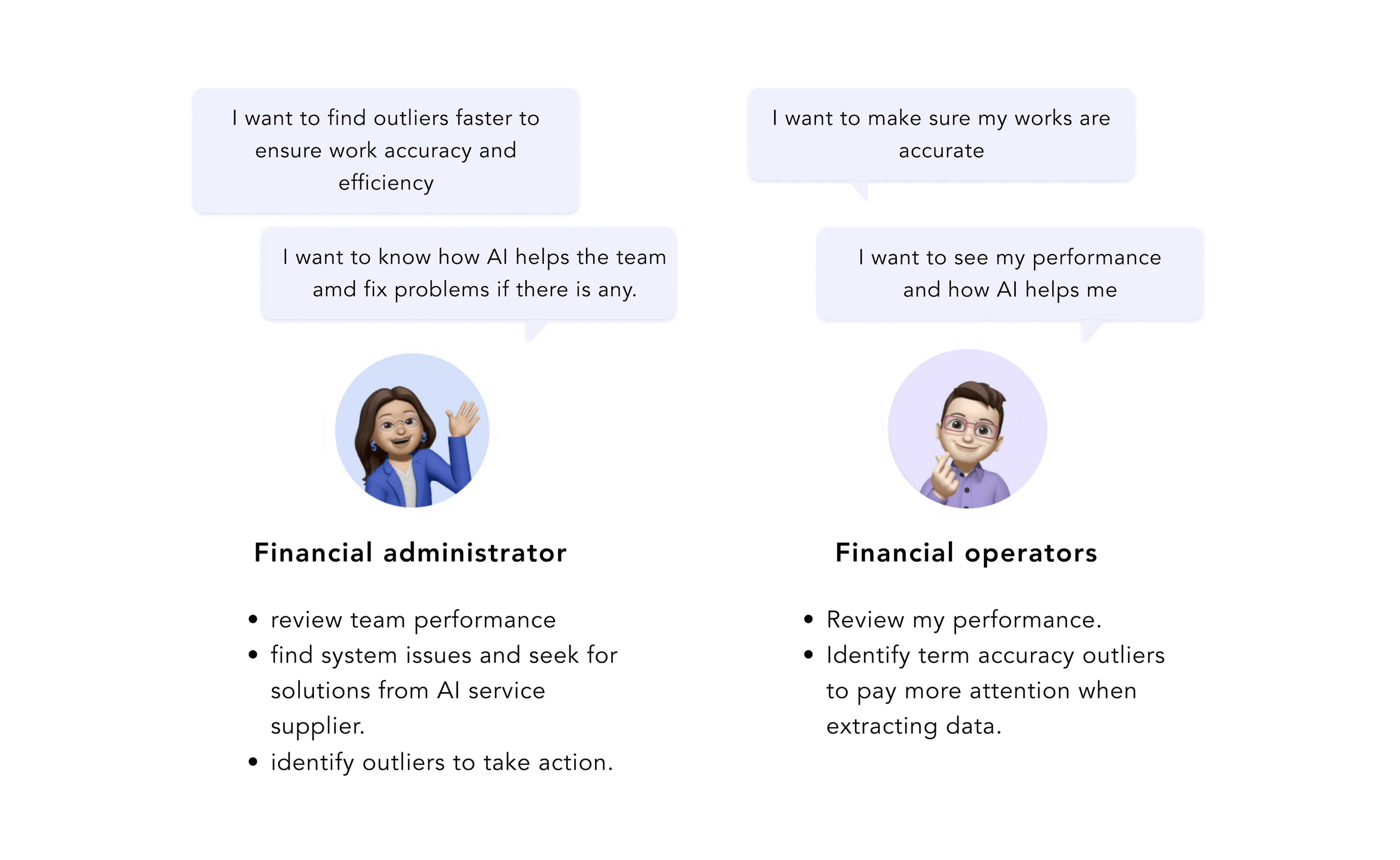
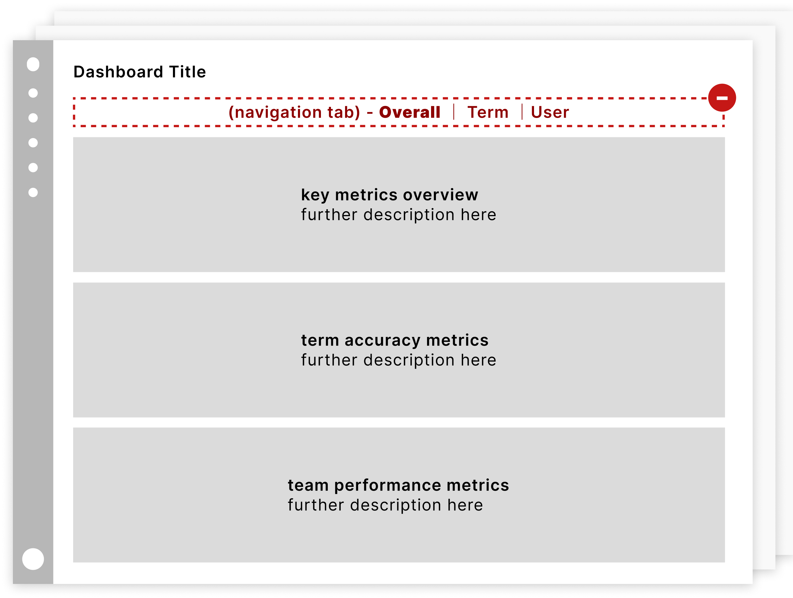
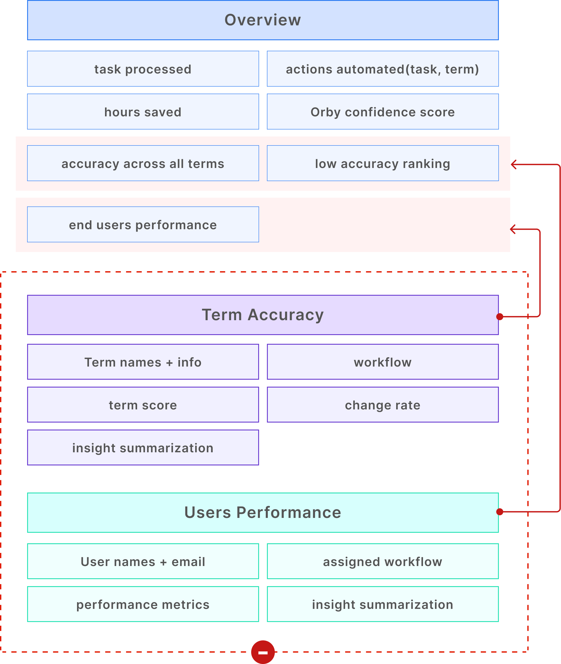
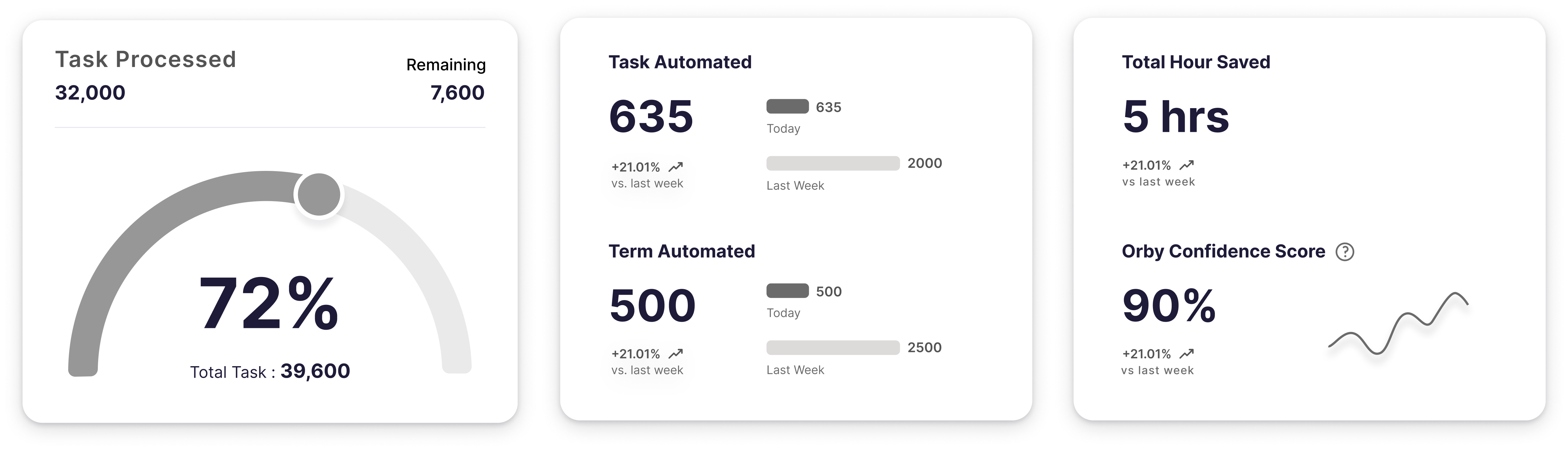
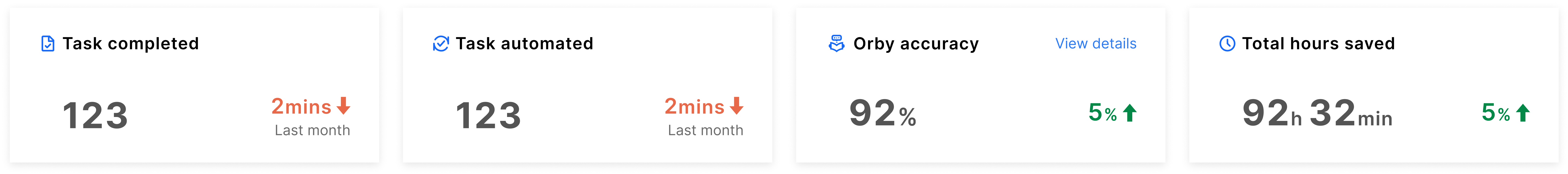
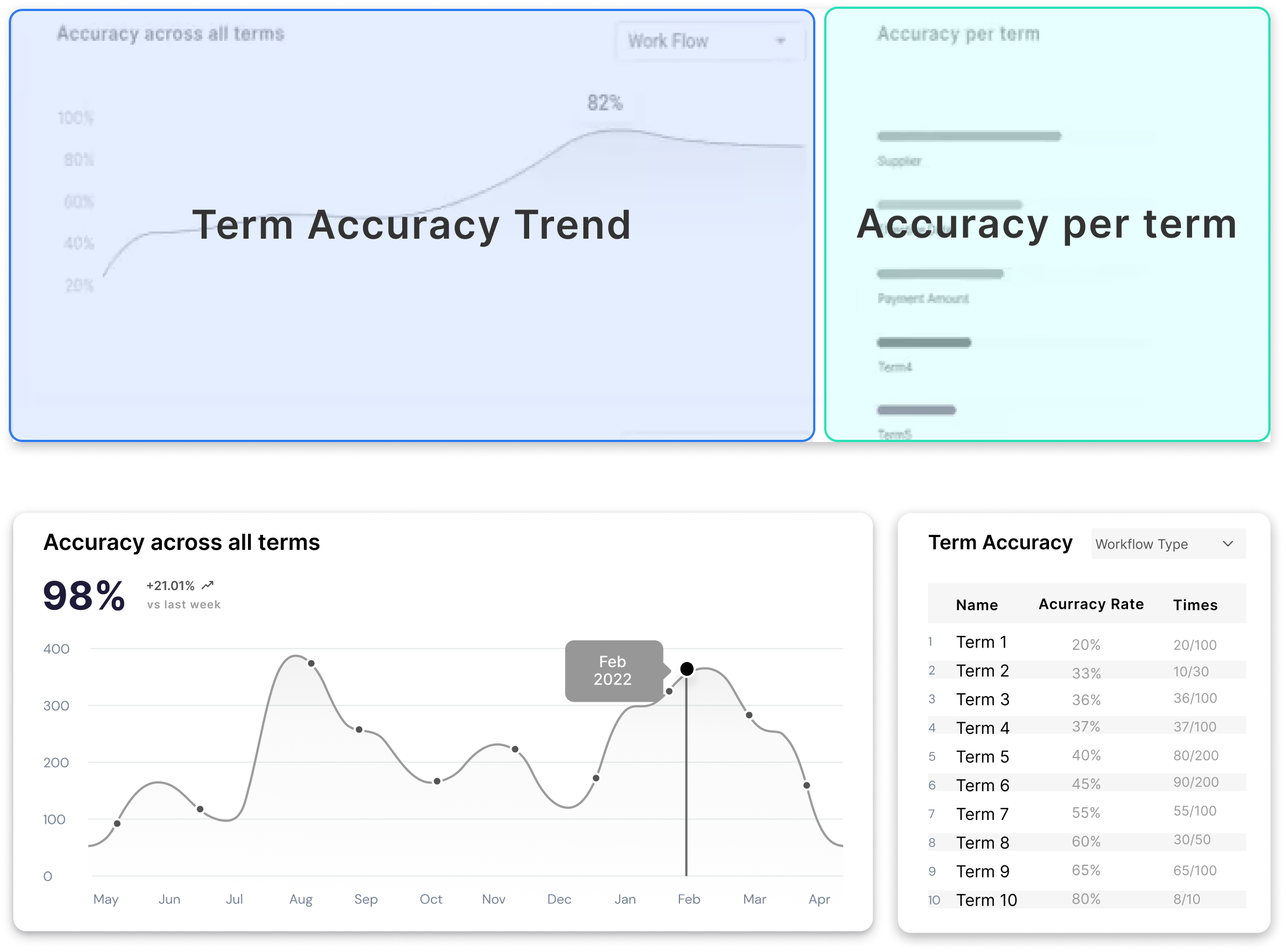
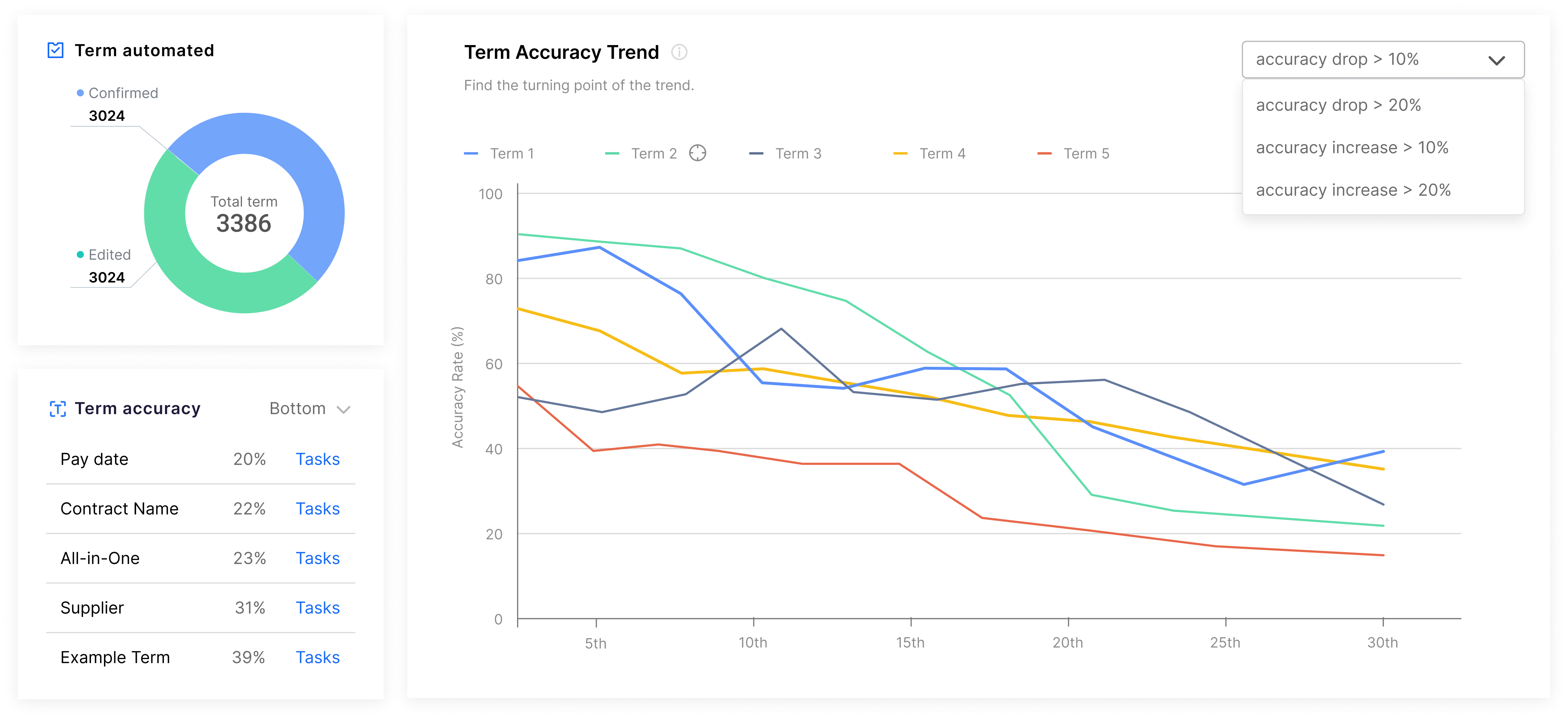
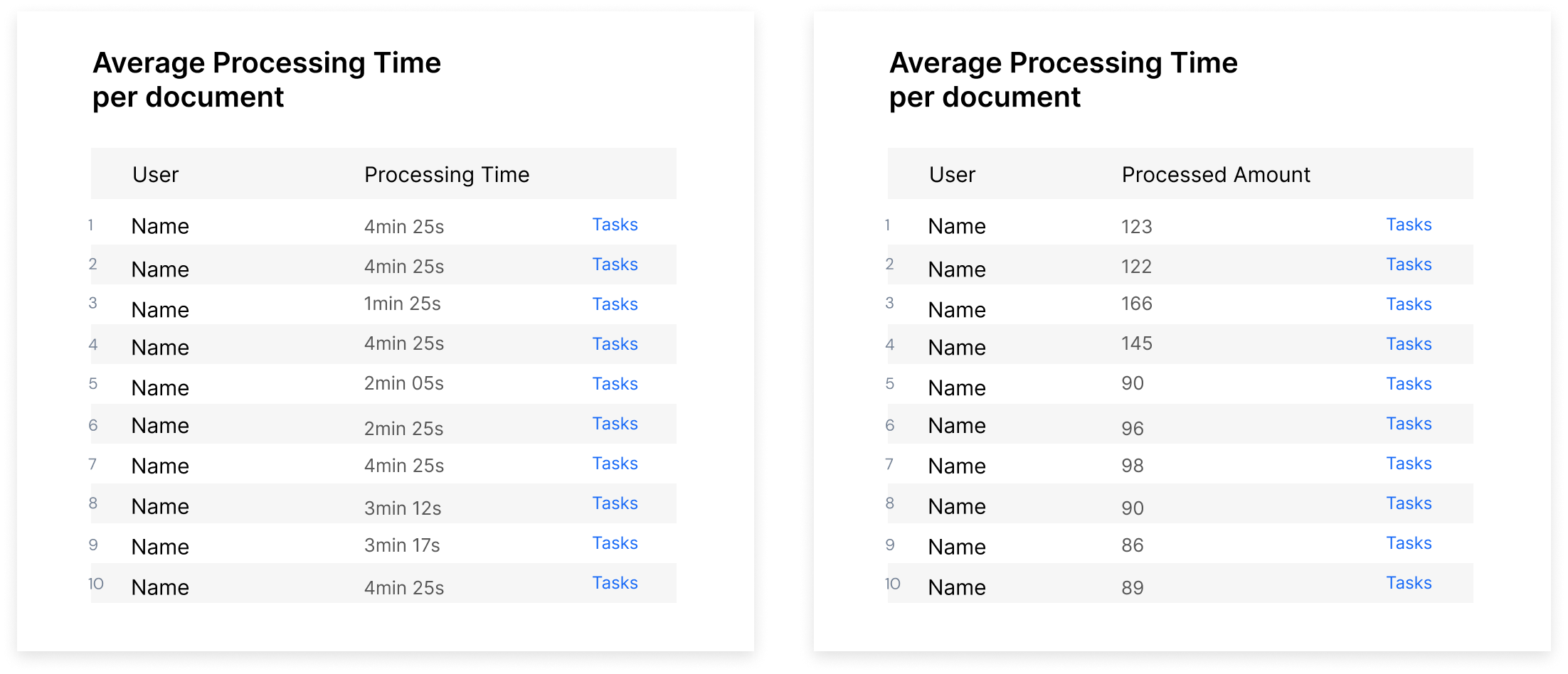
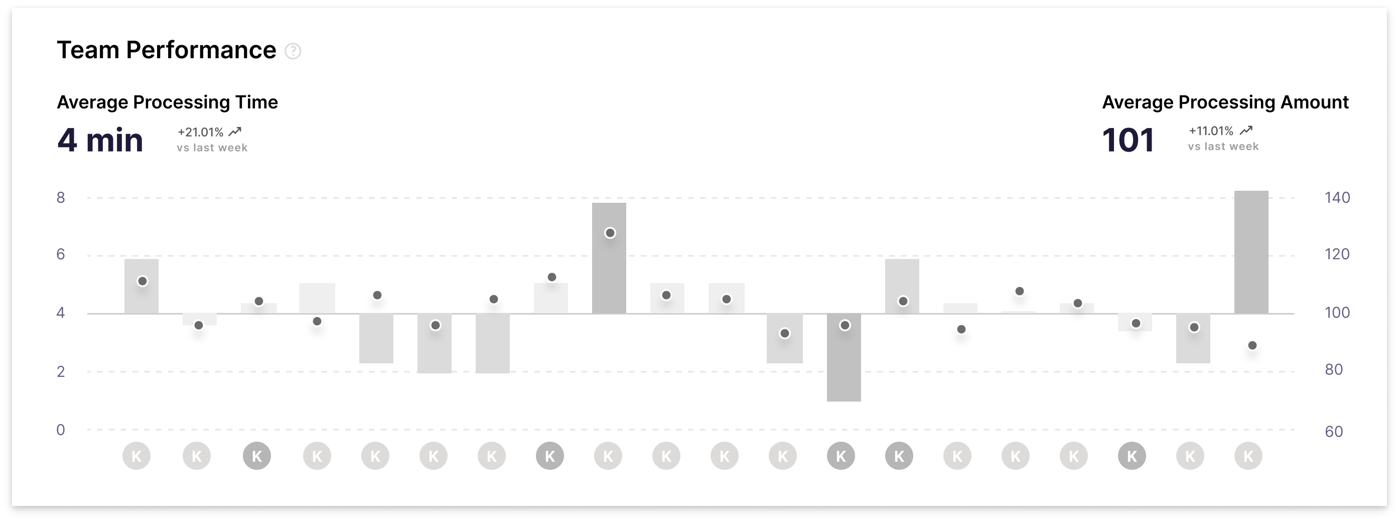
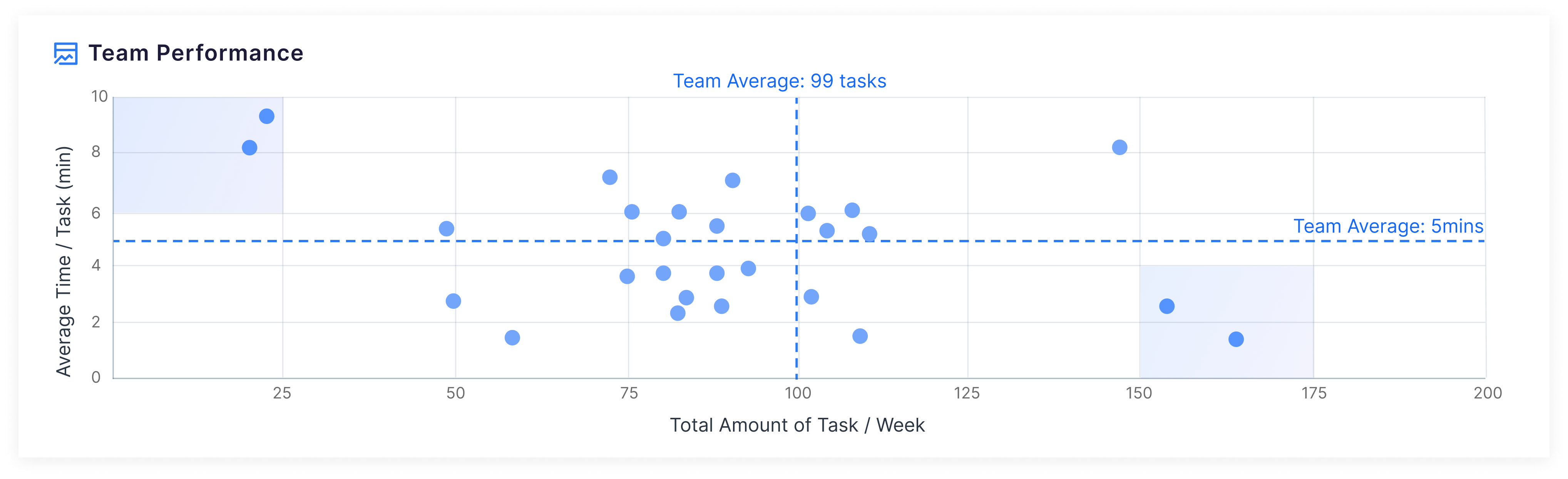
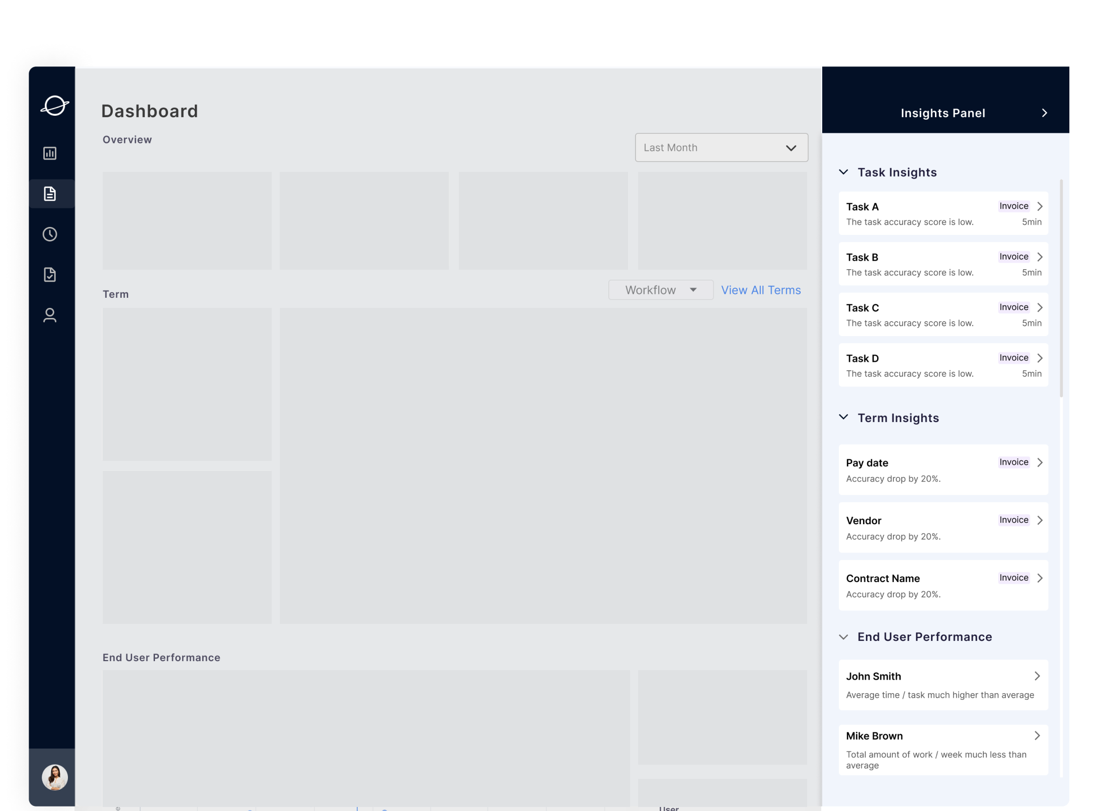
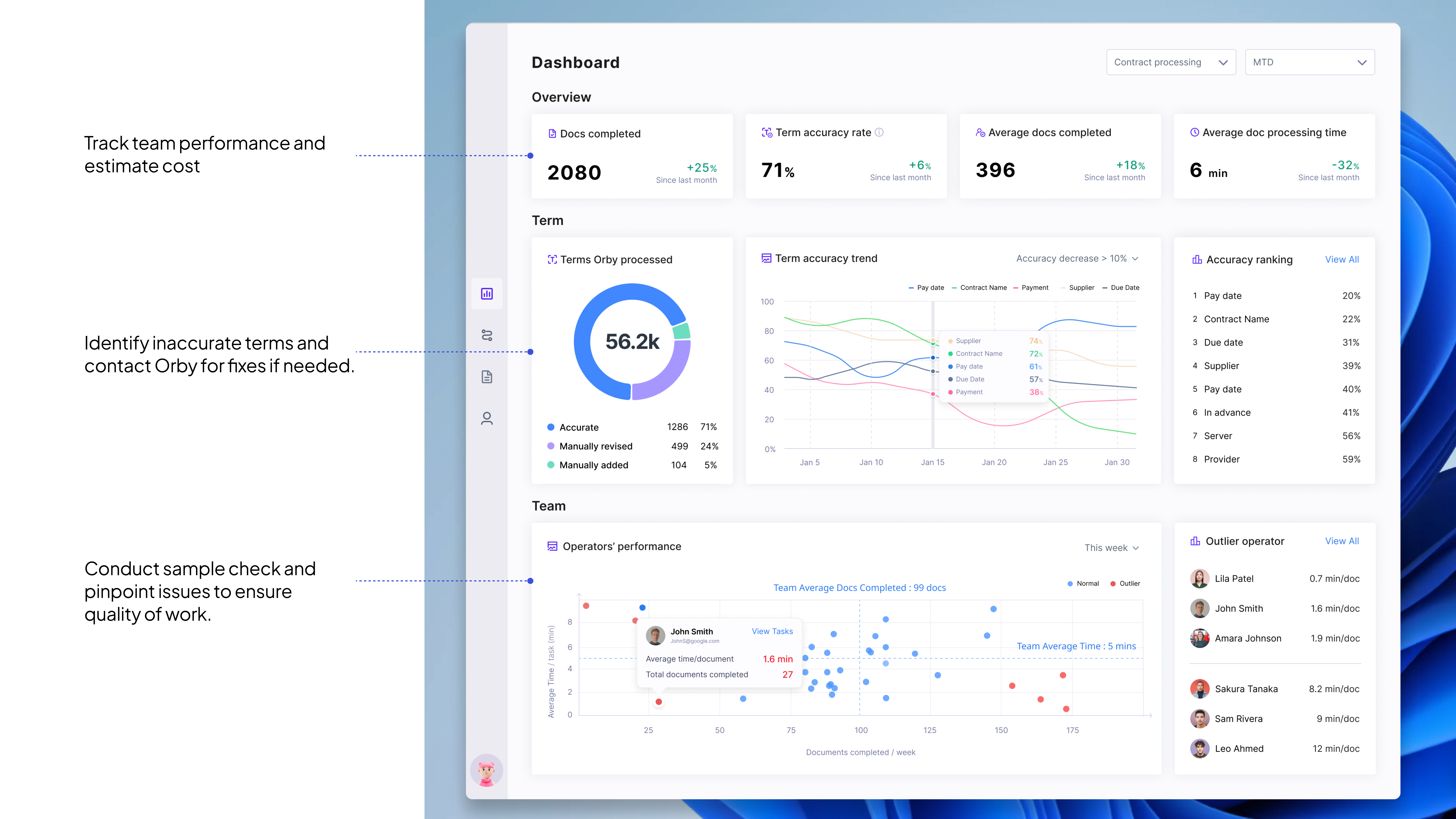
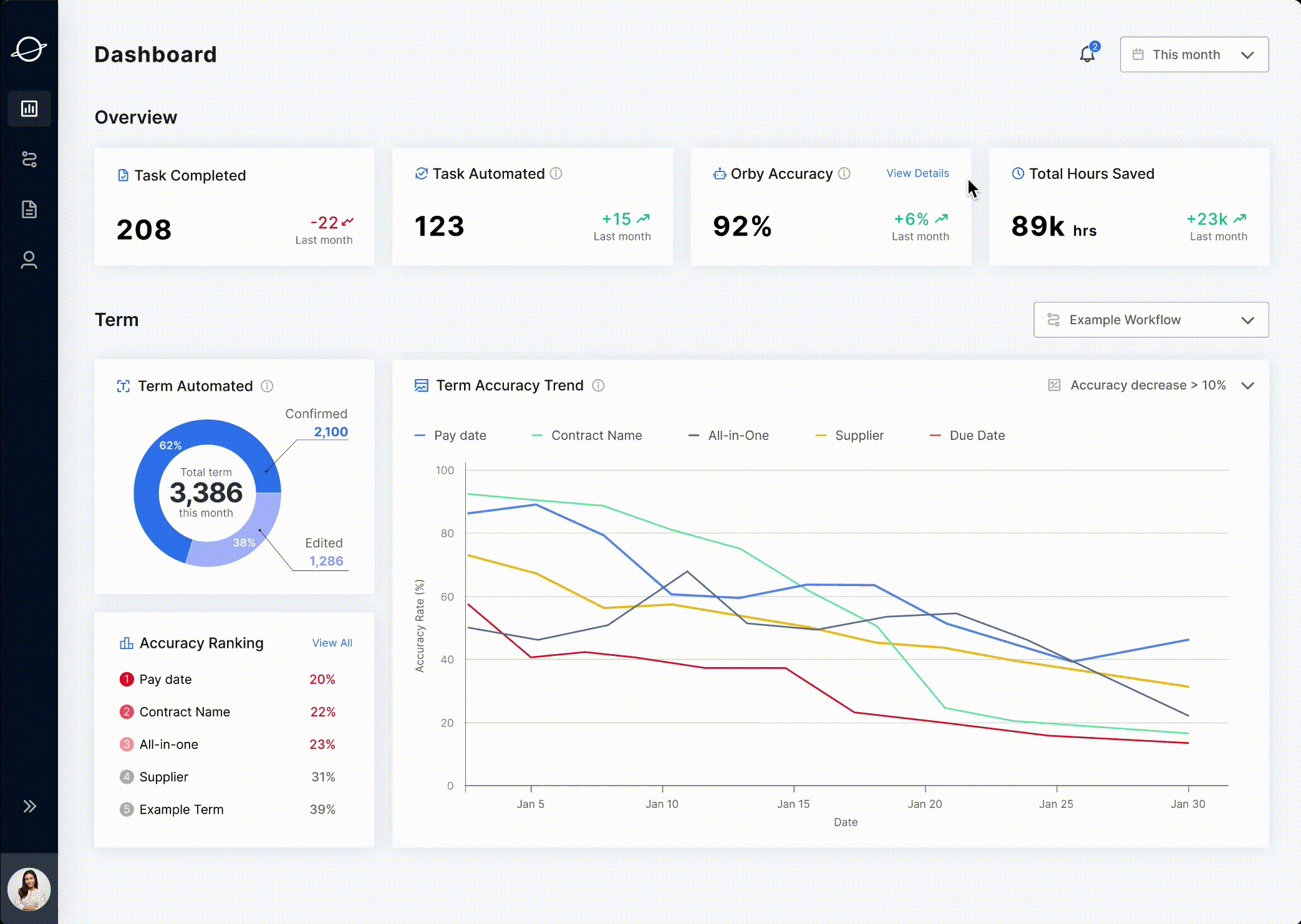
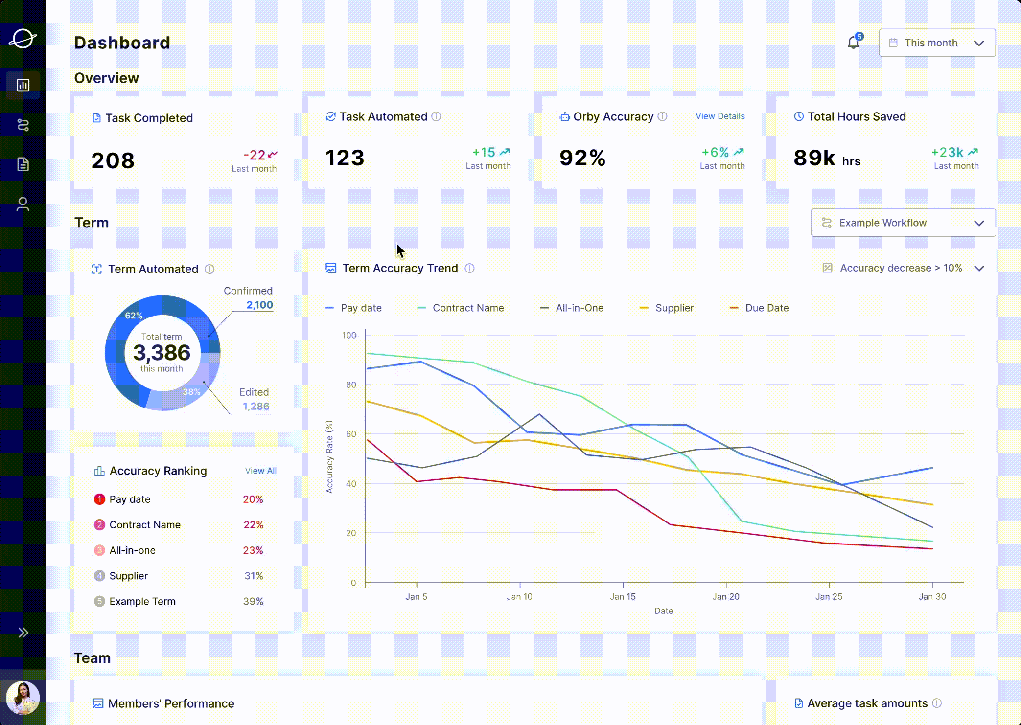
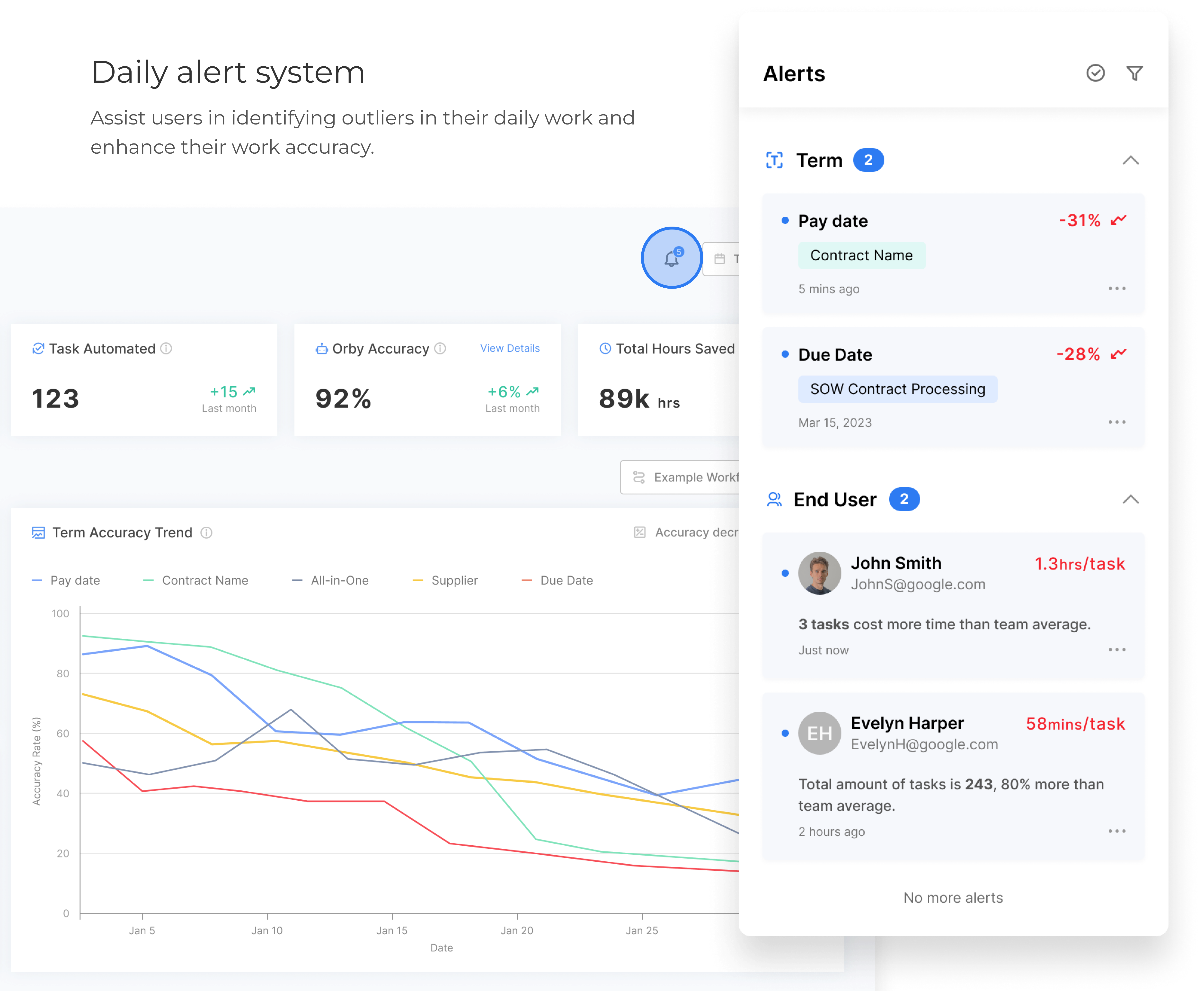
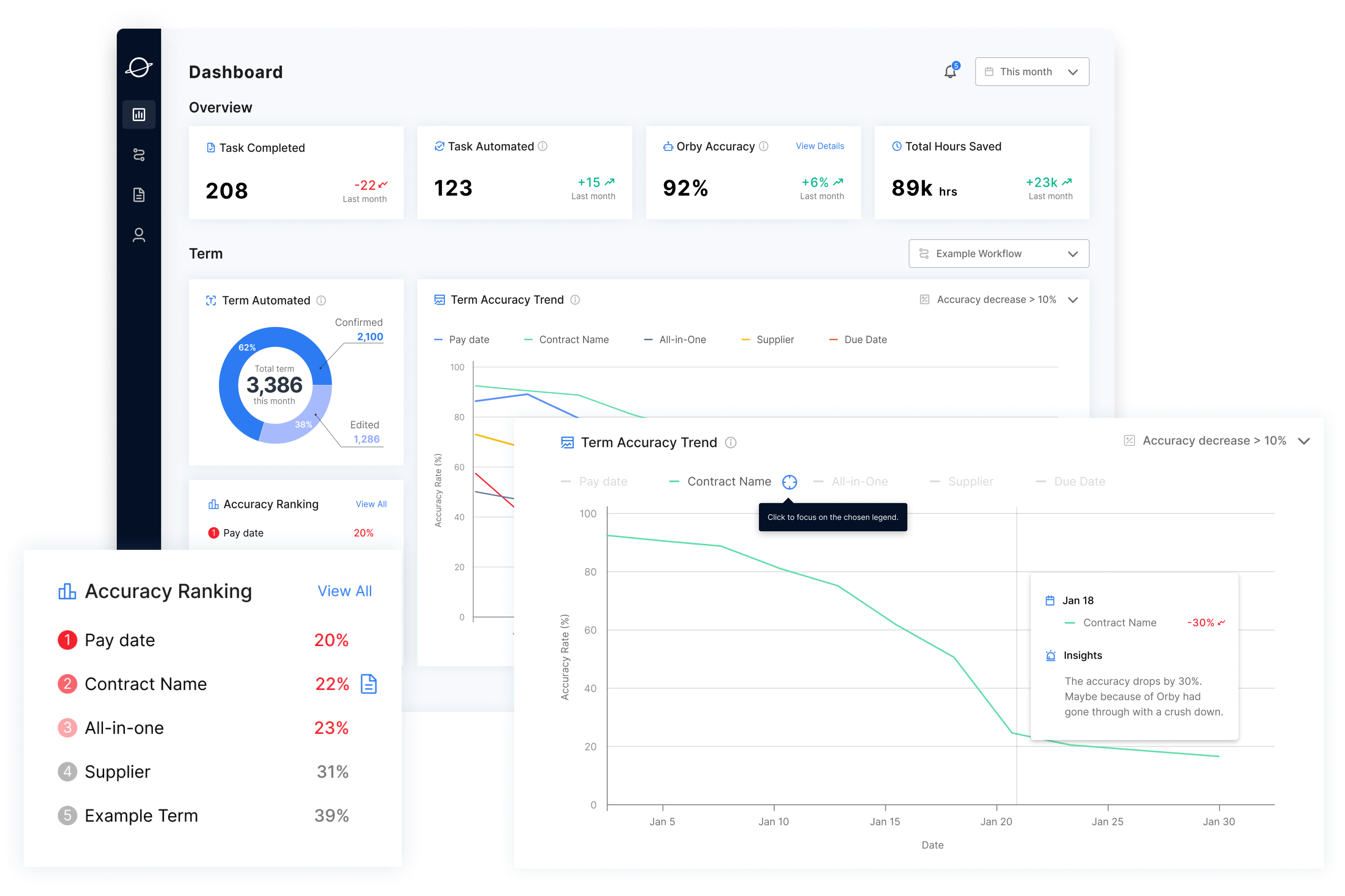
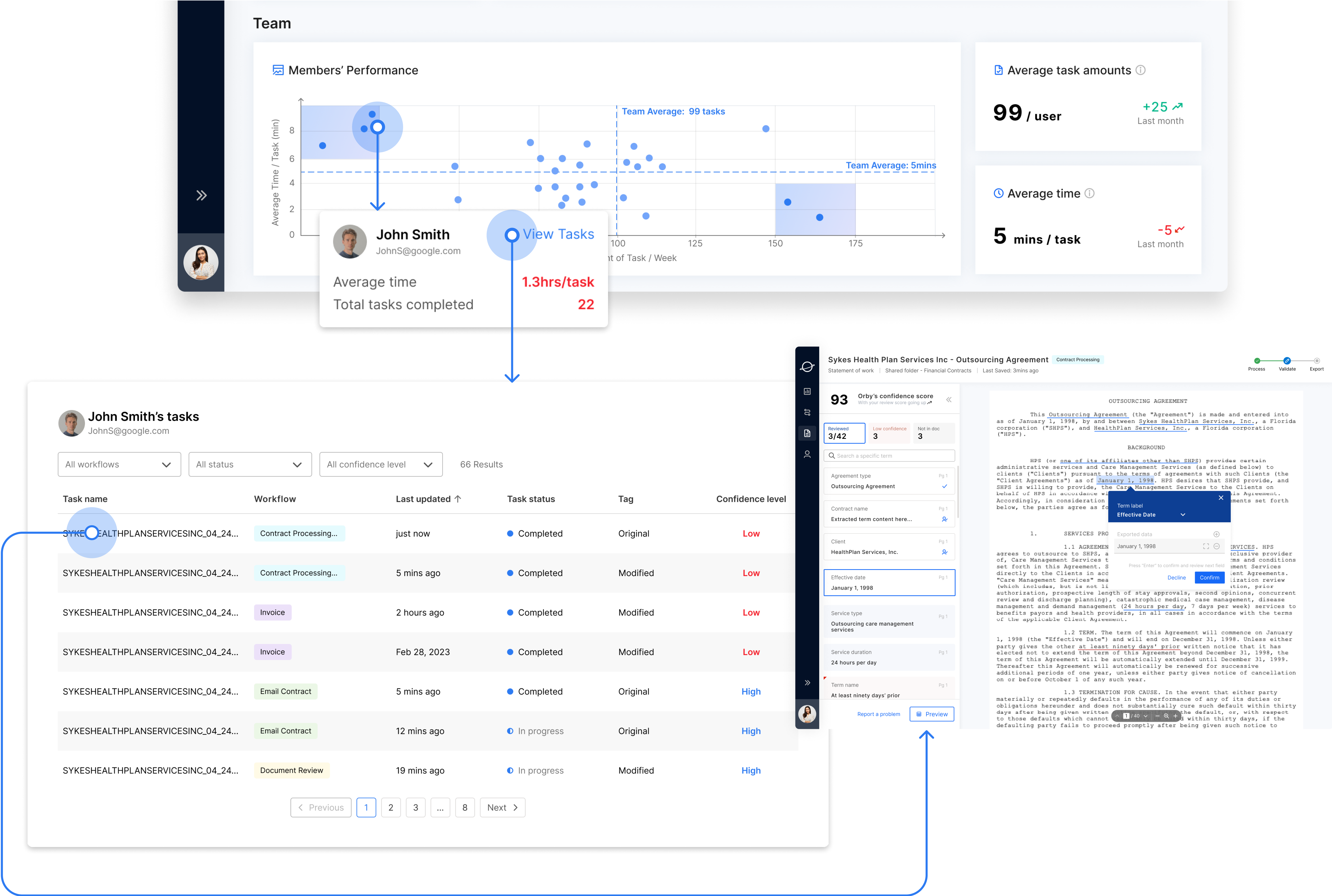
Dashboard to monitor performance and identify outliers

Orby AI automates repetitive enterprise workflows using AI. A key challenge was building user trust in AI agent and surfacing system performance issues, particularly for financial teams who rely on accuracy and transparency.

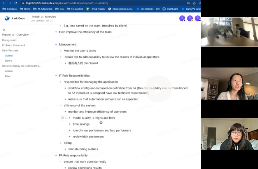
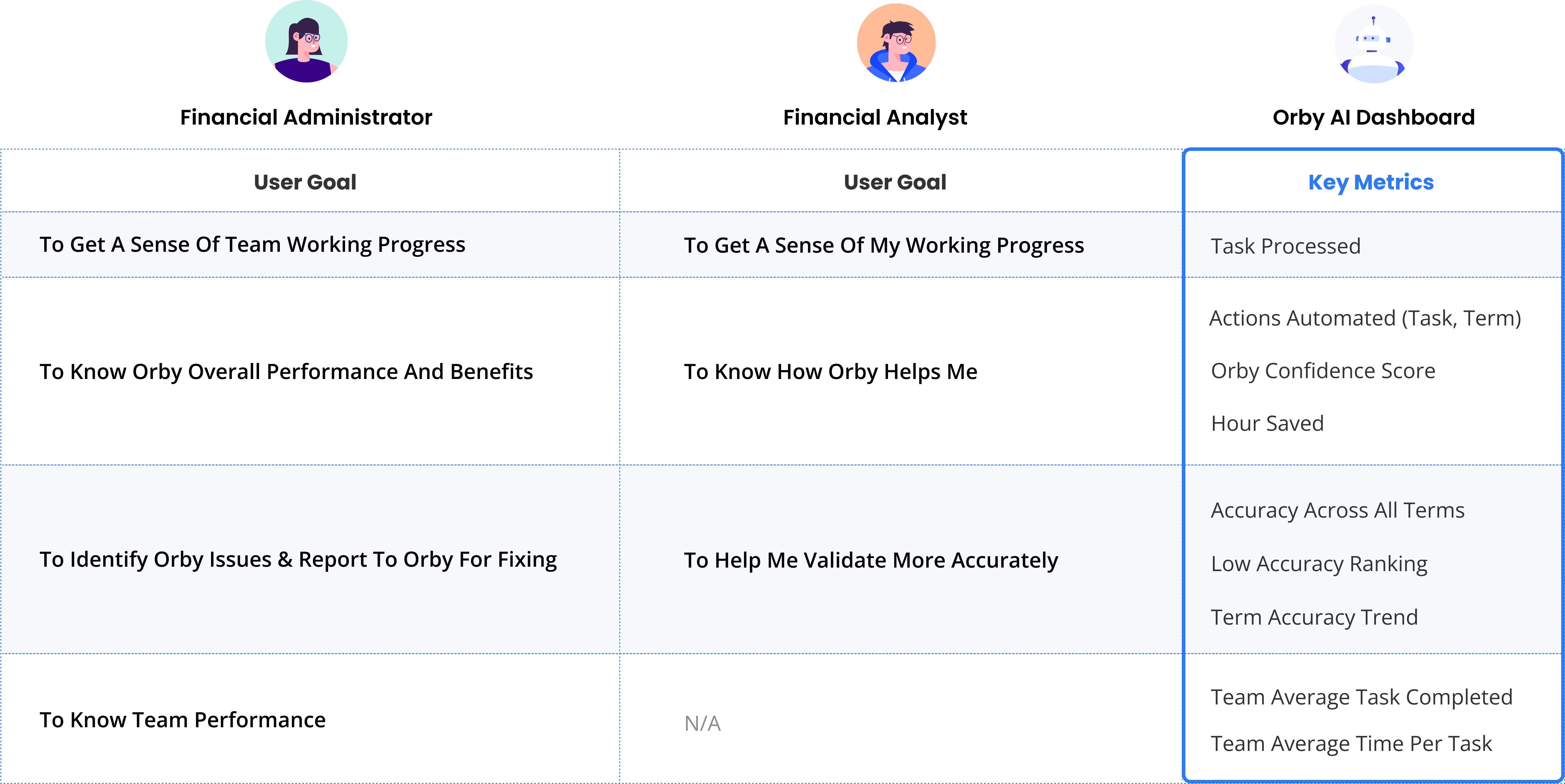
As designer, I conducted interviews with stakeholders and domain experts to uncover workflow pain points; I worked with PM and defined the key user goal and metrics and created wireframes for error detection and system metric visualization. We delivered a 0-1 dashboard product tailored for financial teams, driving 30% improvement in  operational efficiency. This dashboard significantly boosted user nature trust score from 40 to 70, contributing to the successful funding of $4.5 million in a seed round for the company.

PROJECT TYPE

UX designer - shipped MVP

TEAM

1 Project manager, 2 Engineers

MY ROLE

Stakeholder & domain expert interview
Wireframe & high fidelity prototype

DURATION

Jan 2023 - July 2023

IMPACT
-55min
Document processing time
+30%
Operational efficiency
+30
User natural trust score
4.5m
Seed funding
BUSINESS GOAL
+ Provide visibility into data accuracy and system performance.

+ Allow users to identify and report errors or contact support for debugging.

+ Showcase the impact of AI to boost user confidence and willingness to keep using the product.
How can we increase financial team confidence and enhance work efficiency?

Final Solution

During financial analyst daily work, they will check notifications to understand Orby's term accuracy and potentially identify term outliers, drill down to related tasks, and gain valuable insights.
For financial administrators, their goals are efficiently delivering work summaries, managing team performance, detecting potential team outliers. They will use mainly the overview to produce work summary and check team performance to manage teams
Design Challenges
Stakeholder Interview
Clarify business scope & Sync client interview feedbacks
  1. Understand work routines and user goal of different users
  2. Pinpoint essential troubleshooting data during work monitor
  3. Define design scope and client consideration
Complex domain knowledge in processing AI & financial team workflow
As an intern new to this type of SaaS product, I need to quickly fill gaps in my expertise. To address this, I conducted competitive research on similar competitors studying the dashboards of these similar products, summarizing how they visualize  key information, provide alert system, and offer insights.
01
Alert System
A great dashboard design blends explanations and exploration, with alerts and insights to help users make smart decisions at work.
02
Key Metrics Summary
Summarizing metrics helps users quickly understand what to monitor without getting overwhelmed by excessive data.
03
Data Visualization
The design should be simple and efficient, using effective data visuals for easy information access and user interaction.
Meet Main Users
The two primary personas have distinct perspectives when analyzing data, allowing them to enhance their decision-making capabilities in their respective work routines.
User Goal & Key Metrics
We have identified a comprehensive list of metrics that cater to the user goals of two main types of users, allowing them to gain valuable insights into the performance of the Document AI system. These insights enable informed decision-making, workflow optimization, and ultimately lead to higher productivity and success in their daily work routines.
Design Exploration & Iteration
More efficient dashboard structure by eliminating navigation bar
In the first iteration, we abandon the initial concept of a navigation tab design in order to limit redirection and reduce development difficulty.
Simplified


Before
Iteration 01 : Simplify Key Metrics

Get info at a glance

BEFORE

  • Show less but needed data to reduce cognitive load
  • Limit use of graphic to reduce the difficulty in development

AFTER

Iteration 02 : Term Accuracy
To assist users in narrowing down specific term outliers, the identified conditions are :
when accuracy changes dramatically or when the accuracy rate is extremely low or high.

BEFORE

  • Overall accuracy may not highlight specific issues; Users still need to verify individual terms.
  • Users might examine tasks that includes problematic terms.

AFTER

  • Empower users to filter based on drop/increase rates for informed decision-making.
  • Term Accuracy ranking can drill down to specific tasks to directly correct/review.
Iteration 03 : Team performance
01 2 separate tables
02Line Chart + Bar Chart
Cons:
  • Readability issue when cross-checking two charts
  • The horizontal axis lacks sufficient scalability to accommodate a large number of users.
WINNER
03 2 Axis Scatter Chart
  • Utilize a dual-axis approach to represent two dimensions of performance metrics in a relative manner.
  • To maintain chart comprehensibility, associate each point with a team member to avoid overcrowding.
  • Highlight the problematic areas.
Iteration 04 : Alert System
01 Side Panel
Cons:
  • Dashboard will be compressed
  • Filling the entire panel in the empty state might be challenging.
02Orby Extension
Cons:
  • The current extension features are primarily designed for interaction purposes.
  • Not in Phase 1 MVP scope
03 Alert Icon + Pop up
Final Solution
  • Utilize a more commonly recognized alert icon for better user familiarity.
  • Implement a lightweight pop-up window with minimal content to ensure a streamlined user experience.
Design solution
Feature 01
Daily Alert System
USER GOAL 01
  • Detect and effectively handle any outliers in the workflow
  • Increase work accuracy
SOLUTION
  • Feature panels tailored to the workflow and provide clear indications of outliers and actionable insights
  • Prompt users to take appropriate actions that improve work quality and productivity
Feature 02
AI Performance Monitoring System
USER GOAL 02
  • Monitor AI model performance over time
  • Identify outliers
SOLUTION
  • Track term abstracting performance of the AI model overtime and monitor model output accuracy
  • provide insight for potential reasons and help user diagnose and address issues effectively
Feature 03
Team Performance Tracking System
USER GOAL 03
  • Monitor team performance
  • Identify outliers in the team
SOLUTION
  • Allow administrators to monitor and track the team performance indicators, such as average task amounts and average time and identify outliers
  • Check outlier’s task table to further investigate into the tasks and associated documents
Reflections & Next Steps
Reflections
Throughout this project, I embarked on a journey of learning, diving deep into the domain knowledge of B2B document AI and immersing myself in the work routines of our users. Conducting user interviews played a crucial role in gaining insights into their day-to-day tasks.

During the design process, my colleagues and I collaborated to create a diverse range of solutions and iterations. We maintained open communication with the development team and stakeholders, consistently aligning our efforts with iteration planning. While challenges and pushbacks are expected due to development costs, we embraced them as opportunities for creative problem-solving and refining our designs.
Stakeholder & Users
  • Actively involve stakeholders and users throughout the design process
  • Ensure the final solution aligns with business goals
Domain Knowledge
  • Conduct thorough research on the document AI domain, B2B,B2C,SaaS
  • Highly related to user's work routine and user goal
Design Scope
  • Set clear expectations of the delivery and success metrics related to the primary goals
  • Help client redefine their goals and key features
Iteration Planning
  • Scalability is important and many nice to have features can be added in the feature.
  • Find balance between diverging and converging
Prioritization
  • Design features need to be prioritized by must/ nice to have, especially for version 0. MVP is necessary
Stakeholder & Users
  • Using open source material helps to save labors and time.
  • Dev cost must be taken into considerations including technical constrains, time and budget.
Next Step
More customized dashboard for different users.
Customize
  • Category and location of the metrics in dashboard can be customized.
  • Column and filter in task tab can be customized.
Responsive
  • Dashboard layouts may be adjusted across devices/ windows.
Admin Access
  • Admin can access end users’ dashboards to check on their work
Diverse Drill Down
  • More types of drill down may be applied, include hover drill down in key metrics cards.